ViviScout
Turning an early‑stage health-tech site into a curiosity‑driven lead magnet.
Lead product / UX & visual designer
role
tools
Framer, Figma, Procreate
team
Grace Wong, James Chen (ViviScout CEO, Founder)
duration
May-August 2025
Spark curiosity about ViviScout’s continuous cardiovascular monitoring.
Clearly explain the problem space while revealing just enough about the solution to prompt outreach.
Position ViviScout as credible to users and potential partners.
Build a flexible, easy‑to‑update site in Framer that can scale as the product matures.
Goals
Challenges
No device to actively market — the founder wanted an educational, pre‑commercial website rather than a traditional product marketing site.
Content and navigation mixed investor, patient, and clinical messages, making it difficult for any one audience to find what they needed.
Need to protect IP and avoid over‑promising in a space with regulatory and clinical constraints.
Pain Points
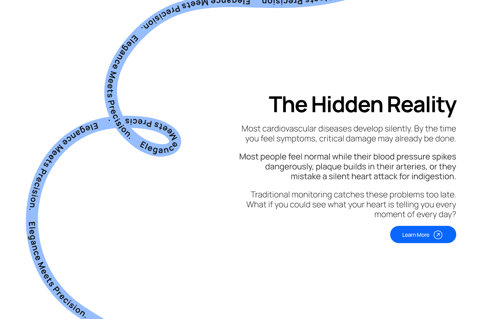
The original ViviScout website made it hard to understand what the product actually does or which cardiovascular problem it solves.
Disconnected hero messaging, dense statistics, slide-style marketing graphics, and text-heavy charts created visual noise instead of clarity. Fear-based language without explaining how ViviScout could help.
The result? Users had to work too hard to piece the story together. Overlapping pages and inconsistent hierarchy led to confusion and mistrust rather than confidence in the solution.
Competing audiences
Unclear product
Information overload/weak hierarchy
1. Competing audiences
Fragmented narratives towards patients, investors, clinicians.
The landing speaks directly to at‑risk individuals/the general public about their personal heart risk with fear-based language.
While other pages pivot into investor/marketing language, such as “market landscape,” growth charts, along with other pitch‑deck style content.
Uses stats that feel more suited to investors, payers, or policy stakeholders.
Hero headline “You are a Walking Time Bomb” creates emotion, but never sets up the context for what ViviScout is, or what problem it addresses.
2. Unclear what ViviScout actually is
Above‑the‑fold space is dominated by a cartoon of a walking bomb, which feels more like a PSA than a product.
3. Information overload & weak hierarchy
Heavy use of stats and charts with little to no narrative.
Important benefits (24/7 device, alerts, peace of mind) are tucked into equal‑weight boxes, competing for attention.
Pie charts and graphs are small and text‑heavy and hard to read. Especially on smaller screens.
Focuses on founder talks and summit videos, which speak more to partners and investors than to everyday users worried about heart health.
Core Needs
Create an educational, pre‑commercial site that clearly explains ViviScout and the cardiovascular problem it addresses. While sparking curiosity without over‑explaining or alarming users.
Turn fragmented messaging into one coherent story that can speak to at‑risk individuals, clinicians, and partners while guiding everyone toward a single primary action: reach out.
Share enough about the early‑stage technology and clinical study to build credibility, while protecting intellectual property and avoiding over‑promising.
Design and build the site in Framer so the team can quickly update content and evolve the experience as the product matures.
Research
I ran a competitive audit of direct and indirect competitors (Ganance, WHOOP, Oura, Apple Watch, Fitbit, Garmin, Aktiia/Hilo), rating each on first impressions, user flow, content, and brand identity.
Competitive analysis showed that clearer sites explained what the product is, who it’s for, and why it matters, using straightforward benefits rather than technical or medical jargon.
Competitive audit
Key Patterns/Take-aways
Many examples with dense text, unclear hero messaging, or visually busy layouts made comprehension harder. Sites with more intuitive navigation and consistent visual systems appeared easier to use, while those with cluttered menus, redundant pages, or inconsistent imagery required more effort to explore.
Clear calls-to-action and accessible support also contributed to smoother user flows. Overall, competitors with a more focused voice and clearer target audiences demonstrated more cohesive communication than those mixing multiple tones or user segments.
Design
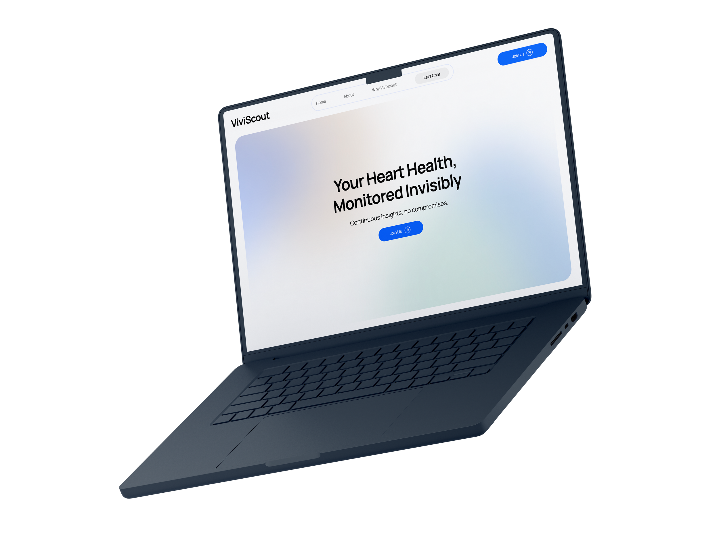
The final designs focus on sparking curiosity rather than driving direct conversion.
By restructuring the site around a clear narrative and intuitive user flow, visitors are set up to understand the problem and naturally feel guided through the story, revealing just enough about ViviScout’s value while protecting sensitive IP.
Building in Framer allowed me to move quickly from concept to prototype to production, keeping design, content, and interactions unified in one place and enabling the team to iterate with ease.